Written by Matthew Smolenski
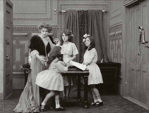
Prior to the 1912 Townsend Amendment to the Copyright Act of 1909, the only avenue available to film distributors looking to protect their work was through the submission of paper prints containing every single frame as individual photographs. Due to the laborious nature of this process, some studios would attempt to circumvent piracy through the placement of their logos throughout their films’ in intertitles and, more strangely, within mise-en-scène. The upper-class household subject to a home invasion in 1909 D.W. Griffith film The Lonely Villa, for example, is abundant with the Biograph Company’s circular ‘AB’ logo as part of its interior design, fostering not only an impression of studio prestige but also an association between the company and Griffith’s much-promoted formal techniques on display throughout the film.
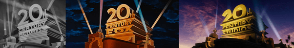
As such primitive necessities have disappeared over time, the studio logo’s function is now primarily front-loaded, bearing the burden of signifying a cohesive studio identity without obstructing the diverse range of films it precedes. If the platonic ideal of such a function were to exist, it would most likely be found in the logo of 20th Century Studios, recently renamed from 20th Century Fox following its acquisition by the Walt Disney Company. Iconographically dating back to 1933, this logo always begins with marching drums that introduce Alfred Newman’s triumphant fanfare as accompaniment to the grand scale of its spotlit textual monument, which, especially in 1933, connotes the same essence of modernity and prestige as the Hollywood sign erected a decade prior. The addition of camera movement in its later digitally rendered variants further give the sense of this logo occupying physical space, towering above a tiny, distant Hollywood sign and the Californian denizens implied by the city lights beneath it and the exotic palm trees that remain beside it. Regardless of genre, tone, or content, every film preceded by this logo is provided the impression of a red-carpet premiere.
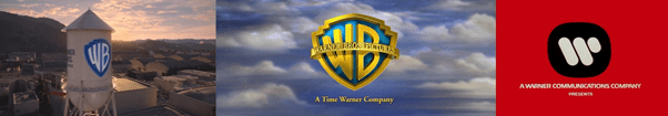
Warner Bros. employs a similar blend of real-world industrial context and monolithic fantasy in its studio logo, which focuses on the production side of its iconic studio lot (signified by a water tower in its more recent, sleeker iteration). The logo as a two-dimensional image is doubled, first appearing within the lot itself before its reveal as a reflection on the side of the studio’s sky-bound emblem, linking the grounded reality of the succeeding film’s production to its omnipotent status as a work of art. Any mention of Warner Bros. is, of course, incomplete without mention of Saul Bass’ bold, stylish 1970s logo design, which most recently opened Todd Phillips’ Joker (2019)to establish the film’s period setting. Although Bass’ minimalist perfection and intense red is immediately complementary to films such as Barry Lyndon (1975), Badlands (1973) and Dog Day Afternoon (1975), its use in Joker speaks to a much broader trend of film-specific logo variants that further blur the lines between corporation and content.
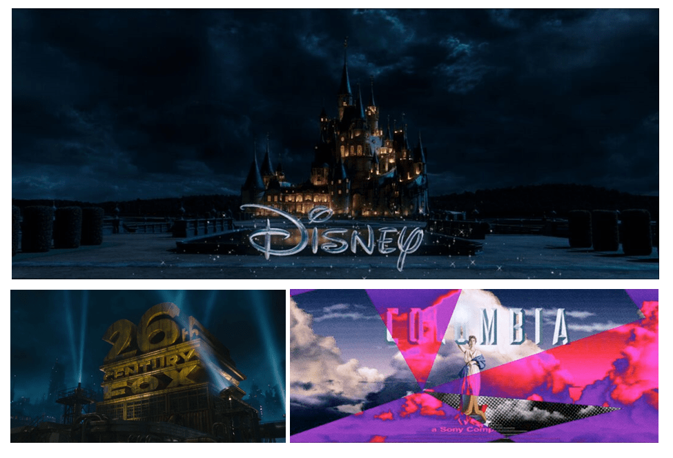
Some films adorned by Saul Bass’ silent logo, for example, would implement a J cut of sorts by introducing the film’s soundtrack over the logo before cutting to the film itself, rendering studio identity inseparable from the film’s narrative. One particularly memorable use of this technique is the replacement of Universal’s iconic fanfare in The World’s End (2013) with the beginning of the song ‘Loaded’ by Primal Scream which scores the film’s opening narration, appearing to broadcast Peter Fonda’s sampled speech from The Wild Angels (1966) across the studio’s equally iconic panning globe with the exact youthful arrogance that constitutes the narrative’s core conflict. Variations on existing studio fanfares have also proven popular, humorously evoking the wearying mediocrity of a middle school brass band in Soul (2020) through an atrocious rendition of Walt Disney Pictures’ ‘When You Wish Upon A Star’ orchestration to signify its protagonist’s feeling of missed potential. Disney, however, is also fond of visual alterations that keep the original fanfare intact, such as in Beauty and the Beast (2017), which creates a mashup of the usual Disneyland castle with the film’s mid-1700s French castle before a seamless visual transition to the film’s narrative. Perhaps most charming is the use of a ‘26th Century Fox’ logo at the beginning of Alita: Battle Angel (2019), which in its own sly manner implies an evergreen quality to the studio’s place in culture (tragically ironic given the redundancy of the ‘Fox’ part following its absorption by a larger corporation), while Spider-Man: Into the Spider-Verse (2018) manages to stylistically unify four different logos in its opening with manic glitches bathed in Ben-Day dots that connect the printing method of its comic book origins with the photographic effect of chromatic aberration.
Other personal favourites range from Unfriended’s (2014) radical data-moshing of Universal’s logo to Indiana Jones and the Kingdom of the Crystal Skull’s (2008) modest fade from Paramount’s mountain to a molehill. Every logo variation in this spirit could be said to return to the effect of early silent film anti-piracy measures but without their primitive motivation; seamlessly weaving extra-textual company identity into the fabric of the film.
To shift mediums then, doesn’t a blog logo serve the same function? It is front-loaded, appearing at the top of the page as the first website element visible to a reader, while colouring their perception of the content they are about to read. Like the Biograph logos in The Lonely Villa, however, it is also a part of the website’s “space”, always accessible by way of a quick upwards scroll. For this reason, after over a year of successful operation, Reel Talk is proud to introduce its own stylish logo!
Reel Talk would like to extend a huge thank you to Nic Younger for very kindly taking the time to design and realise this amazing logo! She can be found at @nfydesigns on Twitter and nfy.designs on Instagram.
